Customize Payment Form
The default Stripe payment form is designed to work seamlessly with most websites, but you might want to customize its appearance to better match your brand or design requirements. This code sample shows how to modify the visual styling of the Stripe payment form using Stripe's appearance API, including colors, fonts, spacing, and other design elements.
This approach gives you complete control over the payment form's appearance while maintaining Stripe's secure payment processing and PCI compliance. You can adjust everything from typography to color schemes without compromising the security or functionality of your payment processing.
When would you use this?
Payment form customization is particularly useful for businesses with strong brand identities or specific design requirements. Instead of using Stripe's default styling, you can create a payment experience that feels integrated with your site's overall design language.
Common use cases include matching your site's custom color scheme, implementing your brand's typography across the entire checkout experience, adjusting form spacing and sizing to fit your layout requirements, or creating a more premium appearance for luxury brands.
The Code
This example customizes the Stripe payment form with a monospace font, larger text size, custom colors, and modified form element styling.
/**
 * Customize Stripe payment form appearance
 * @param array $options Stripe Element options
 * @param WC_Gateway_Stripe $gateway The gateway instance
 * @return array Modified options
 */
add_filter('wc_stripe_get_element_options', function($options, $gateway){
	if($gateway->id === 'stripe_cc'){
		$options['appearance'] = [
			'variables' => [
                'fontFamily' => 'monospace',
                'fontSizeBase' => '18px',
                'colorText' => '#2b2b2b',
                'colorDanger' => '#d9534f',
                'colorSuccess' => '#AEBCB9',
                'colorWarning' => '#d9534f',
            ],
			'rules' => [
				'.Tab' => [
					'border' => '1px solid #D5D8FF'
				],
				'.Label' => [
					'marginBottom' => '10px'
				],
				'.Input' => [
					'backgroundColor' => '#1212121c'
				]
			]
		];
	}
	return $options;
}, 10, 2);
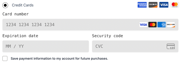
Customized Stripe payment form showing monospace font, larger text size, and custom styling applied to the card number, expiration date, and security code fields
How the Code Works
The code uses the wc_stripe_get_element_options filter, which runs when Stripe Elements are being initialized. This filter receives the current options array and the gateway instance, allowing you to modify the appearance settings before they're sent to Stripe.
The function first checks that we're customizing the correct gateway by verifying $gateway->id === 'stripe_cc'. This ensures our customizations only apply to the credit card payment method and don't affect other Stripe payment methods.
The customization uses Stripe's appearance API, which consists of two main sections: variables for global styling properties and rules for specific element styling. Variables define consistent values used across the entire form, while rules target specific CSS classes that Stripe applies to different form elements.
Customizing Colors and Typography
You can extensively customize the visual appearance by modifying the variables section:
'variables' => [
    'fontFamily' => 'Arial, sans-serif',
    'fontSizeBase' => '16px',
    'fontWeightNormal' => '400',
    'fontWeightMedium' => '500',
    'colorText' => '#30313d',
    'colorTextSecondary' => '#7c7e8a',
    'colorTextPlaceholder' => '#a3a6ba',
    'colorBackground' => '#ffffff',
    'colorDanger' => '#df1b41',
    'colorSuccess' => '#16a34a',
    'colorPrimary' => '#0570de',
    'borderRadius' => '8px',
    'spacingUnit' => '6px'
]
Advanced Element Styling
The rules section allows you to target specific form elements with custom CSS properties:
'rules' => [
    '.Tab' => [
        'border' => '2px solid #e6e6e6',
        'borderRadius' => '8px',
        'boxShadow' => '0 2px 4px rgba(0,0,0,0.1)'
    ],
    '.Tab:hover' => [
        'borderColor' => '#0570de'
    ],
    '.Tab:focus' => [
        'borderColor' => '#0570de',
        'boxShadow' => '0 0 0 2px rgba(5,112,222,0.2)'
    ],
    '.Input' => [
        'backgroundColor' => '#f8f9fa',
        'border' => '1px solid #dee2e6',
        'padding' => '12px 16px'
    ],
    '.Input:focus' => [
        'borderColor' => '#0570de',
        'backgroundColor' => '#ffffff'
    ],
    '.Label' => [
        'fontSize' => '14px',
        'fontWeight' => '600',
        'marginBottom' => '8px',
        'color' => '#495057'
    ]
]
Theme Integration Examples
Match your site's primary colors:
'variables' => [
    'colorPrimary' => '#your-brand-color',
    'colorText' => '#your-text-color',
    'fontFamily' => 'Your Brand Font, sans-serif'
]
Create a dark theme:
'variables' => [
    'colorBackground' => '#2d3748',
    'colorText' => '#ffffff',
    'colorTextSecondary' => '#a0aec0',
    'colorPrimary' => '#63b3ed',
    'borderRadius' => '6px'
]
Important Considerations
When customizing the payment form, maintain sufficient color contrast between text and backgrounds to ensure accessibility compliance. Test your customizations across different devices and screen sizes to ensure the form remains usable and professional-looking.
Stripe's appearance API has specific limitations on which properties can be modified. Not all CSS properties are supported, so stick to the documented appearance variables and rules for reliable results across all browsers and devices.
Testing Your Customizations
To verify your payment form customizations are working correctly, navigate to your checkout page and inspect the Stripe payment form elements. Your custom styles should be applied immediately without requiring any cache clearing.
Pay special attention to form validation states and error messages to ensure they remain clearly visible with your custom styling.
You can also use your browser's developer tools to inspect the Stripe Elements and verify that your custom CSS rules are being applied correctly to the appropriate form elements.